The Soul Foods
Reimagining Everyday Oils With Purpose
Overview
A thoughtfully crafted brand and e-commerce experience for The Soul Foods, focused on transparency, simplicity, and reconnecting everyday cooking with trust and intention.
Tech Stack
Next.jsTypeScriptNode.jsframer-motiongsapTailwind CSS
The Process
At The Soul Foods, everything began with a simple but uncomfortable question: why does something as essential as cooking oil feel so distant, so industrial, and so disconnected from the kitchens it serves?
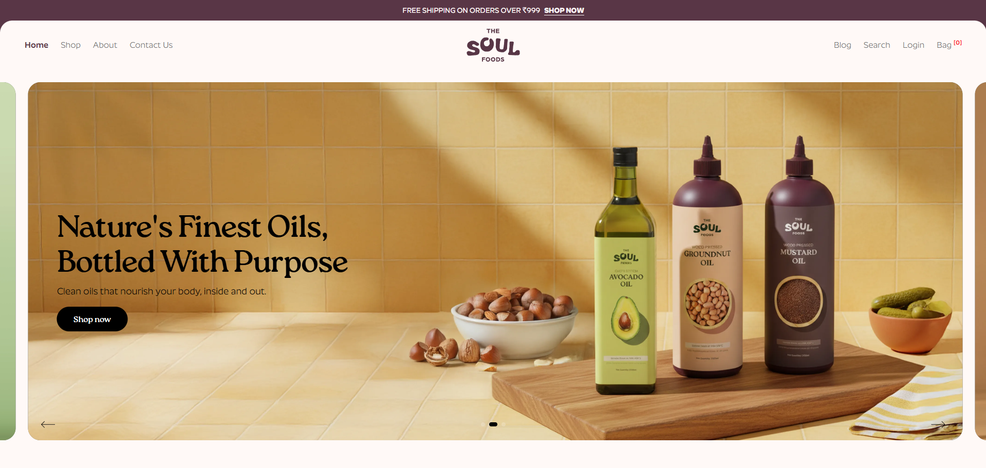
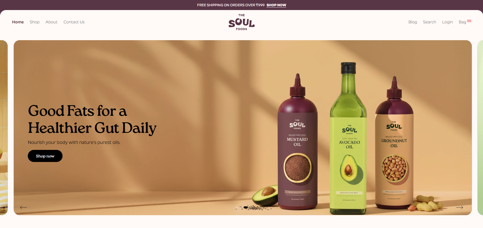
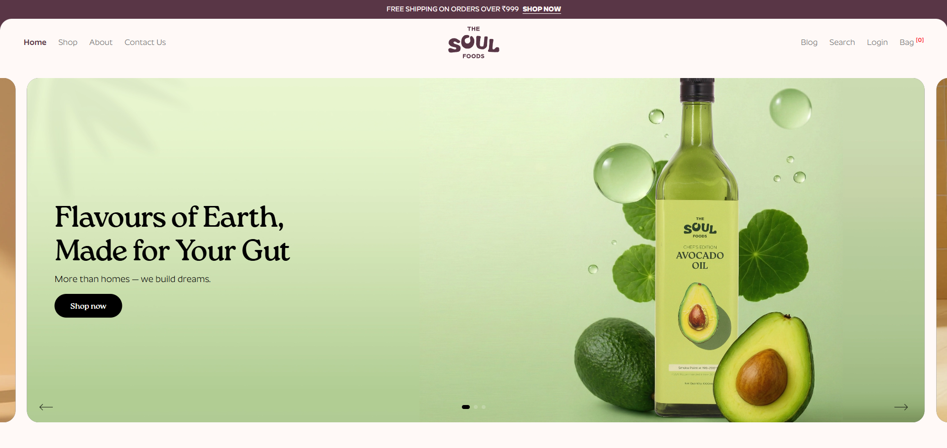
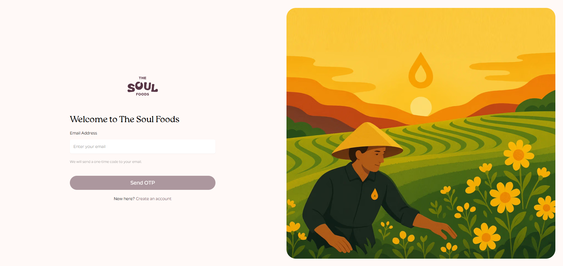
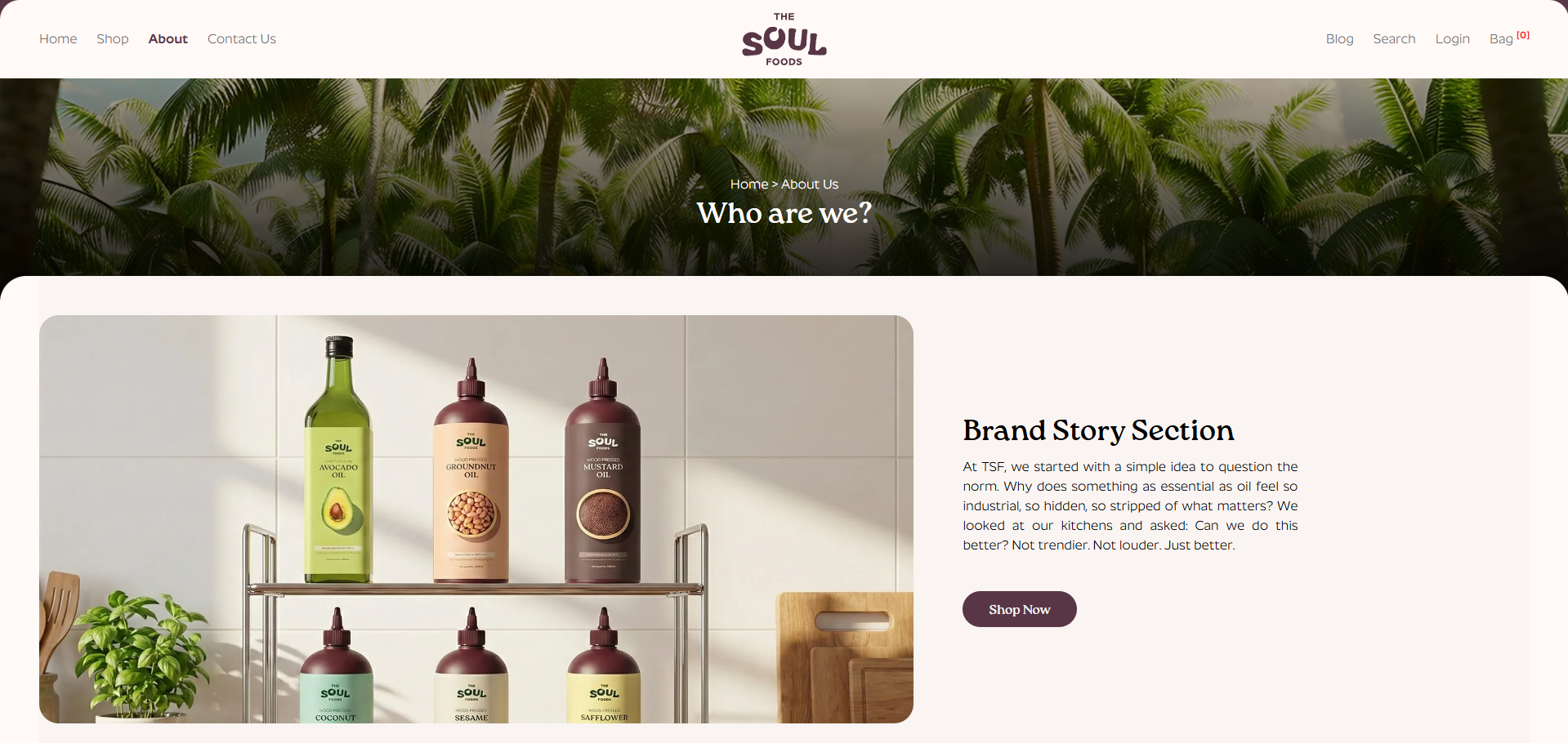
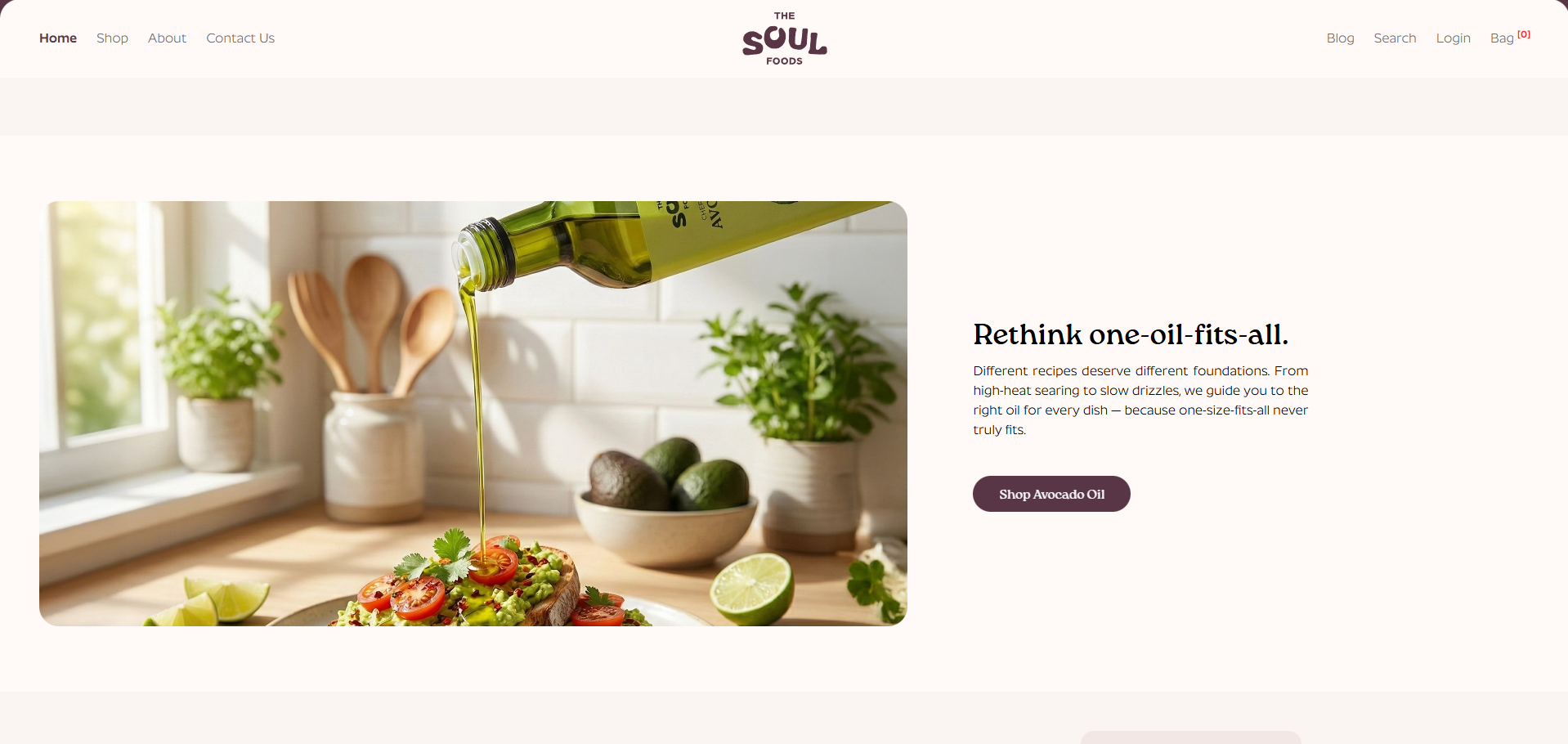
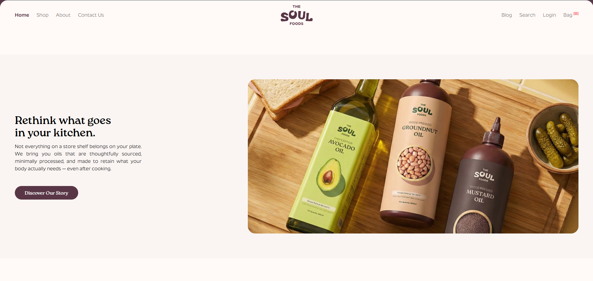
The goal of this project was not to chase trends or loud visual gimmicks, but to build a calm, confident digital presence that reflects the brand's philosophy—honest food, made thoughtfully. The website introduces TSF as a brand that values clarity over clutter and purpose over polish, inviting users to slow down and understand what goes into their everyday meals.
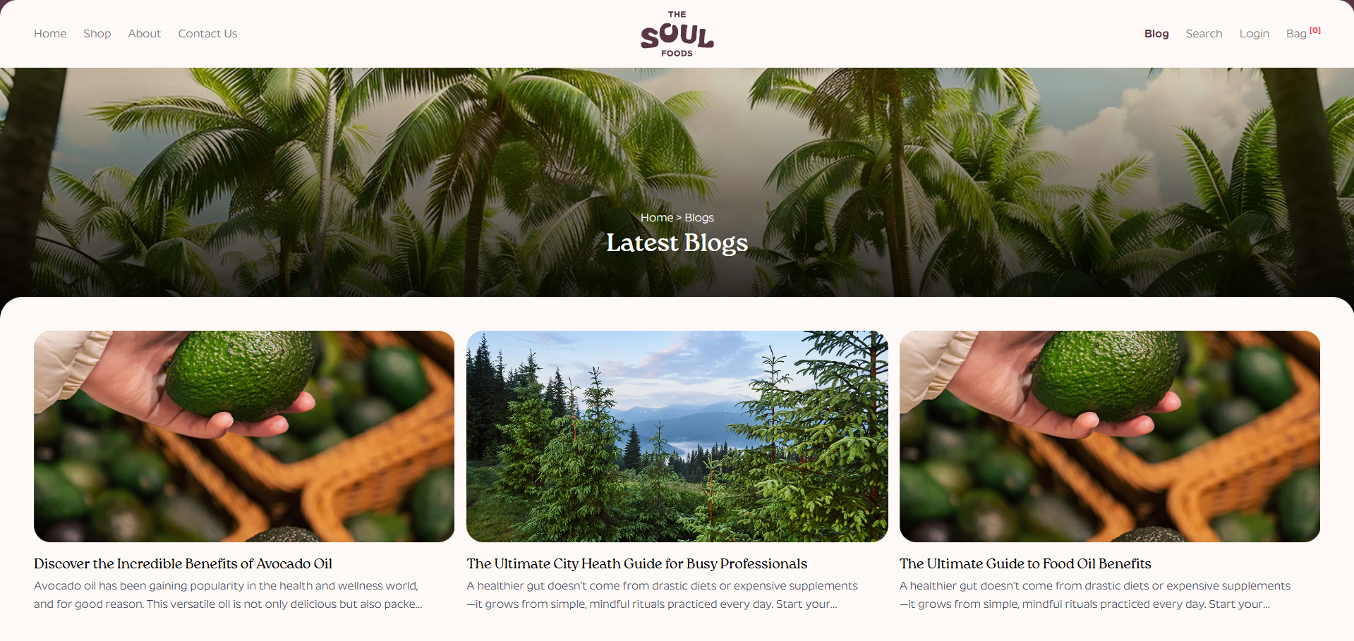
The design language is warm and minimal, inspired by natural textures, muted tones, and generous spacing. Typography and layout work together to create a sense of openness, allowing the story to unfold naturally rather than overwhelm the visitor. Every section is intentional, guiding users through the brand's values, process, and products with ease.
Subtle animations and transitions add depth without distraction. Motion is used sparingly to enhance flow and engagement, ensuring the experience feels refined and human. Performance and accessibility were treated as core requirements, resulting in a fast, responsive interface that works seamlessly across devices.
The final outcome is a digital experience that mirrors The Soul Foods' mission—bringing something essential back into focus, stripping away the unnecessary, and proving that better doesn't have to mean louder. Sometimes, it simply means more thoughtful.
*Note: I worked on this project under DZINR, as it is a client of the agency. Credit for the complete project goes to them.*
The goal of this project was not to chase trends or loud visual gimmicks, but to build a calm, confident digital presence that reflects the brand's philosophy—honest food, made thoughtfully. The website introduces TSF as a brand that values clarity over clutter and purpose over polish, inviting users to slow down and understand what goes into their everyday meals.
The design language is warm and minimal, inspired by natural textures, muted tones, and generous spacing. Typography and layout work together to create a sense of openness, allowing the story to unfold naturally rather than overwhelm the visitor. Every section is intentional, guiding users through the brand's values, process, and products with ease.
Subtle animations and transitions add depth without distraction. Motion is used sparingly to enhance flow and engagement, ensuring the experience feels refined and human. Performance and accessibility were treated as core requirements, resulting in a fast, responsive interface that works seamlessly across devices.
The final outcome is a digital experience that mirrors The Soul Foods' mission—bringing something essential back into focus, stripping away the unnecessary, and proving that better doesn't have to mean louder. Sometimes, it simply means more thoughtful.
*Note: I worked on this project under DZINR, as it is a client of the agency. Credit for the complete project goes to them.*